Read the chapter linked below, and then search online for an image that you find compelling. Add a comment to this posting. In your comment, paste the link to the image, and then add a few sentences discussing its visual strategies. Here is the reading:
http://teachmix.com/challenging/assets/visualbasicandstrategies.pdf
Comments


Visual Strategies Picture
http://www.cbq.qa/EN/AboutUs/News-Room/Downloads/CommercialBankPlaza1200800.jpg
This image is interesting because of its ability to use lines in order to create the illusion of motion. The picture contains lots of lights, but it draws the reader's eye towards the red on the road, and creates the idea of a fast-moving city that's lively despite it being taken during the night. It captures the typical stereotype that cities never sleep, and uses a contrast of colors to really grab and hold the viewer's attention.

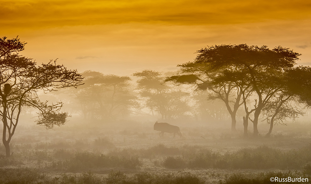
Visual Strategies Image
I chose this image because it employs several visual strategies discussed in the reading to great effect. The contrast in the tonal value and lighting of the trees in the forefront compared to the trees in the background helps to emphasize the fog that envelops the scene, and creates a sort of mysterious effect. Additionally, there is only one animal in the photo, and the location of the animal within the photo (near the middle area) helps to emphasize it in the context of the trees, fog, and sky.

Visual Strategies Image

I chose this image because it utilizes a few key components discussed in the Visual Rhetoric Strategies chapter. For instance, once a person looks at this picture, their attention and eyes will go directly to the tree towards the right because of the beaming sun in the background. The photographer is attempting to emphasize this particular tree, in contrast, to the other tree which is darker and further back in the image. As the author noted in Visual Rhetoric Strategies, since the tree towards the right is darker, the tree represents low value, while the contrasting tree uses bright colors which embodies high value. In addition, besides the tree on the right, the rest of the image uses colors like green and blue which produce feelings of calmness and serenity.

Visual Strategies Image
This image I chose demonstrates the use of proximity to create a visual illusion. It also uses other visual strategies such as arrangement and emphasis by placing the bottle very close to the camera and focusing on the bottle, the image portrays the bottle as something massive compared to the tiny men running behind. There is also use of contrast in lighting, where there are more lighting on left side of the image with the bottle compared to the right portion of the image where it is dark.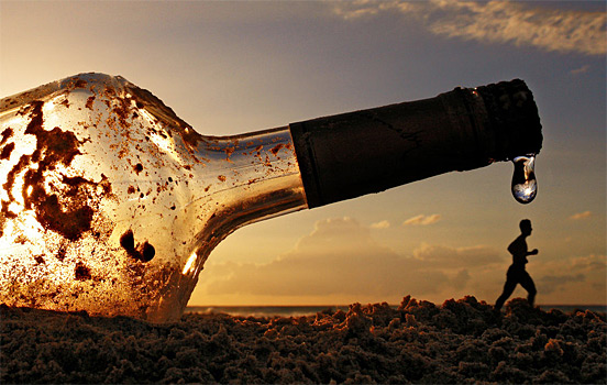
visual strategies image
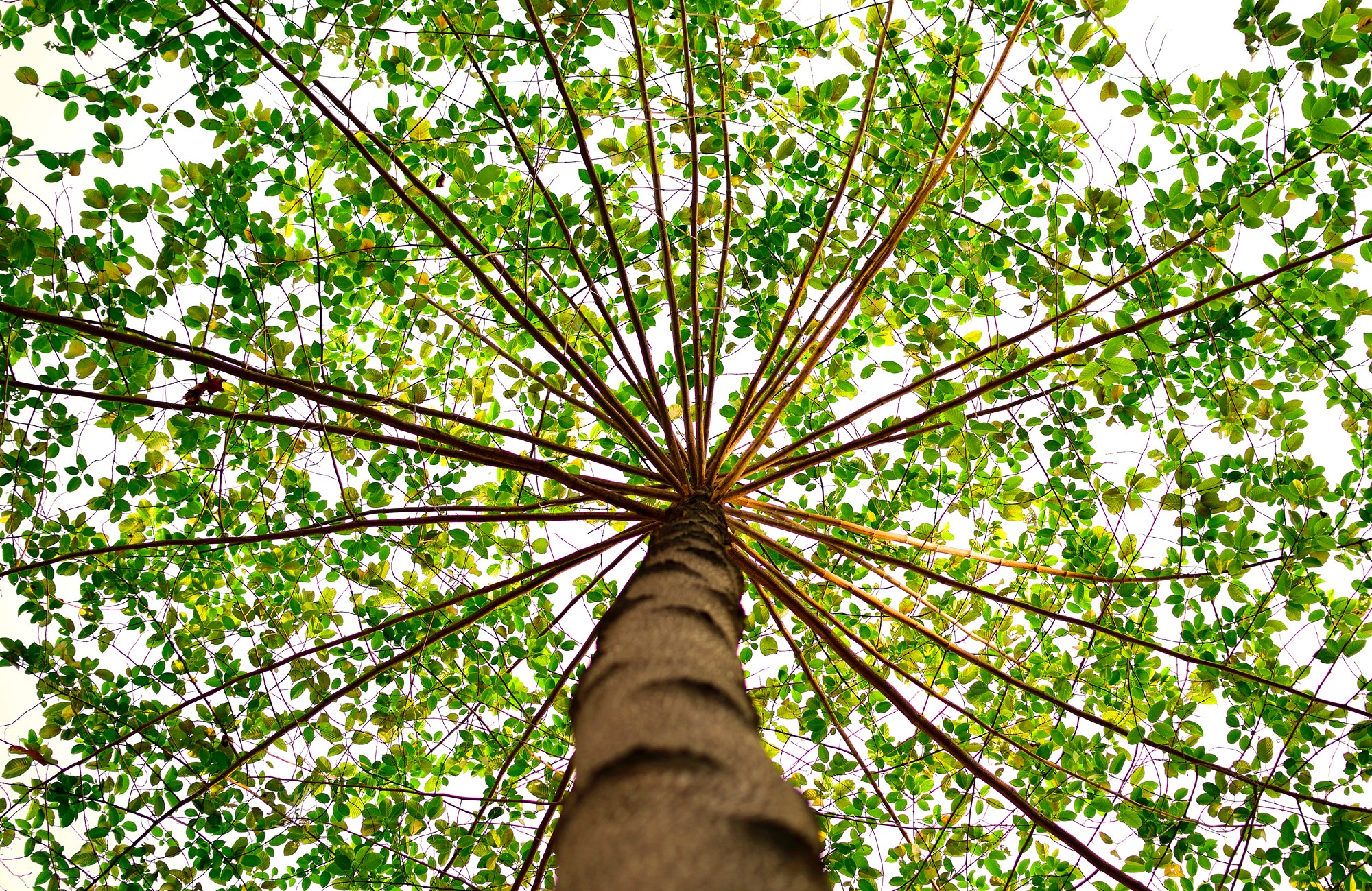
I chose this picture because it has a lot of the characteristics that we read about. While the frame is technically entirely covered, there is a focal point (dot) in the center where the top of the tree turns into the different branches. That is where attention is immediately drawn. Then we see horizontal lines in all directions, creating balance. If they were shaped differently, they might create a scary sensation rather than this calm one created by them being horizontal.

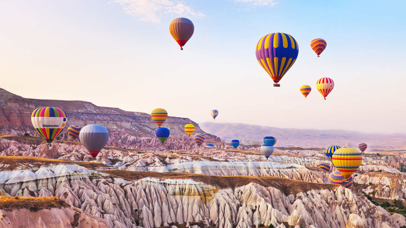
Visual Strategies Image
In this image, there are a variety of visual elements used to create an emphasis on the hot air balloons. The first element I noticed was the color contrast between the pale blue sky/ pale brown mountains, and the colorful hot air balloons. The colors of the hot air balloons makes the picture stand out and draws the audiences attention to the arrangement of the hot air balloons. Second, the different heights and sizes of the hot air balloons give depth to the picture and makes some look closer and farther away. Additionally, the lines on the mountain range gives them a three dimensional look and the mountains in the background have fewer prominent lines and the blurred texture is used to create an illusion that they are farther away. Lastly, the rounded lines on the hot air balloons gives a sense of an upward motion.

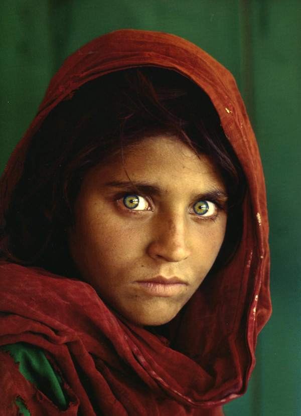
Visual Strategies Image
I talked about this image last week in my photography class and I immediately remembered it when reading the Visual Rhetoric Strategies chapter. I think this photo exemplifies several key elements of a good visual composition. The reason it is so eye catching is because of the balanced color scheme. It has both warm and cool colors (red and green) but they are perfectly repeated and balanced throughout (the green appearing in the background, her eyes and in her clothing). In addition, the blurred out background makes the girl's eyes pop and provides a clear focal point for the viewer.

Visual Strategies Image
https://static01.nyt.com/images/2013/09/12/learning/VTS09-16-13LN/VTS09-16-13LN-superJumbo.jpg
I chose this image because it displays a few of the visual strategies mentioned in the reading. It provides good contrast with the colors of the vehicles, as well as the difference between the blue sky and the ground. The white clouds also balance the image with the color of the ground. The way the cars are aligned provides depth and giving the forwardmost vehicle lots of lead room creates a nice sense of motion.

Imagery Strategies
I chose this photo because it plays with multiple of the tactics discussed in the chapter- lighting, arrangement, scale, balance, tonal value. I felt that this image conveys a feeling of disparity without using a single word or human face. The darkness of the image and the yellowish hue of the moon do not give you warm and fuzzy feelings and leaves the viewer with an uneasy sensation. I really liked the balance of the road going straight down the image as well.


Visual Strategies
In my opinion, this image is absolutely stunning, and the visual techniques used are extremely impressive. The use of warm red in the skirt and cool blue in the background creates a striking contrast that is visually satisfying. The lines throughout the woman's skirt and within the woman's hair create intriguing movement/motion. The lines in the skirt (and the lines in the water) also create a soft, whimsical texture, which contributes to the overall mood/tone of the photograph. The pleasant look on the woman's face also contributes to this tone. The proximity of the woman really draws a viewer's eyes to the subject (creating emphasis). The framing of the woman is also visually intriguing, for it feels as if the woman is almost jumping into the image, further contributing to the visually interesting movement that dominates this composition. Overall, this is an extremely beautiful photograph!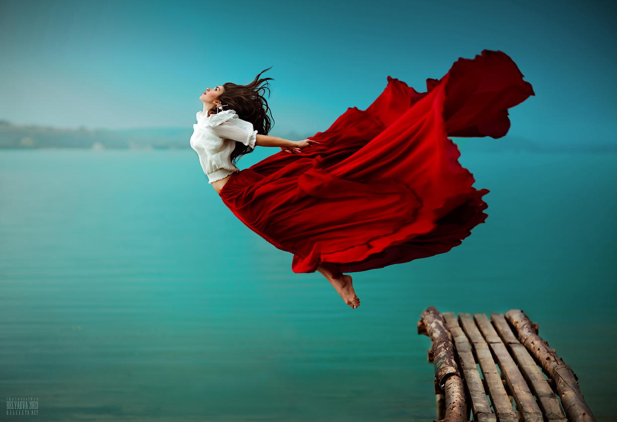
In reply to Visual Strategies by CourtneyNSpencer
I'm not sure how to edit my…
I'm not sure how to edit my post, but the photo was cropped in while writing my analysis. So, strike what I said about the framing. Instead, I'm now noticing the bridge that contains leading lines, also drawing the viewer's attention to the woman. Sorry about that!

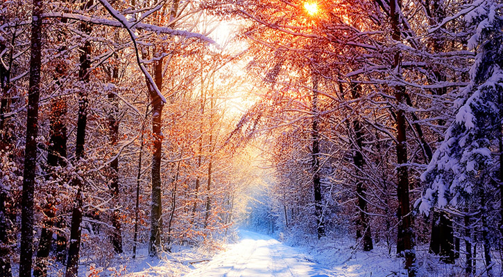
Visual Rhetoric Strategies
This image makes use of a couple of the elements described in the reading. At first glance, there is a noticeable balance to the picture that is evident because of arrangement. The photo is taken from the center of a pathway and one can see trees and branches continuing down the path on both sides. This symmetry adds to the aesthetic and just makes the image more visually appealing. There is also a pretty stark contrast in lighting when comparing the path to its two sides. This is more than likely because the sun is not being blocked on the path like it is on the sides by the trees, but I think that this could also be interpreted more deeply - stay on path in life? Lastly, I thought the tonal value really stuck out in this picture with all the different colors at play here. The use of extreme bright and dark colors make for a really soothing picture when all put together.

https://cdn.vox-cdn.com…
https://cdn.vox-cdn.com/thumbor/CsocGnCZhoLk1O1R6b56oXHAq2I=/0x0:900x598/1200x900/filters:focal(378x227:522x371)/cdn.vox-cdn.com/uploads/chorus_image/image/58443759/eatersea0716_ba_bar_pho_official.0.0.jpg
I've chosen a bowl of pho…
I've chosen a bowl of pho not only because of its inherent deliciousness, but because of the simplistic shapes. The circle represents comfort just like a warm bowl of chicken noodle soup when you're sick. The chop sticks are 2 parallel lines that represent balance. Notice how the chop sticks are angled to direct your eyes to the rest of the image. If the chop sticks were horizontal it is clear to see that the pho would over power the delicacy of the image. Now lets examine the color, notice how the dark back ground compliments the broth while the vibrant pinks and whites are conversing in the middle. This juxtaposition of light directs our eyes towards the main event of the image. Lastly the framing of the image, notice how there isn't much free space. This is powerful because we get a different feel of the image depending on where you look.


Image Analysis
I chose this image for several reasons. First, the reflection given by the water gives the photo a balance that makes the viewer feel calm. Moreover, the contrast in color between the dark tree to the well-lit moon captures the viewer's attention. Also, as described in the reading, the circular shape of the moon makes the image seem more comforting. Finally, the image features colors and tones that are somewhat dull and non-invasive. This also adds to the calming effect produced by the image. 

In reply to Visual Strategies by jsmoke
I chose this photo because…
I chose this photo because it shows how much of an impact a small contrast of color can make. Because the image is sketch-like, the intentional coloring of the person' face signals that the illustrator was purposeful in creating this contrast. The way the image is arranged and frames places a special emphasis on the eyes of the person. The colors of the picture are balanced in a monotone.

Visual Strategies Photo
This image stood out to me because of the frame and the contrast of the composition. It uses the rule of thirds to lend more interest to the picture since the subject is not directly center. This also creates the feeling of movement since the person is walking towards the right side of the frame. The fact that the foreground and the subject is a silhouette also allows the background colors to pop which gives the picture life. Because of the angle as well it looks like the man is walking among the clouds.

Visual Strategies Photo

http://photography.trsty.com/photography/beautiful-photography-by-ashraful
I choose this image because of the immense of blue, yet how the image is not unappealing or overwhelming. Notice how the blue heavy blue tonal value gradually decreases as your eyes move away from the center of the picture, and because of this, I think a focal point is created in the center with the densely blue flowers. And take note of the lighting, the mid and upper left corner are darkened to emphasize the lightly colored petals floating away. But in the center to center-right upper part of the photo, the background lighting is much higher and creates a fading effect as those petals float away. Overall, the combination of light and dark lighting and cool colors create a kind of calmness, peace, and serenity. Also, notice how at the top-center part of the photo there is a stream of orange color - probably coming from the sun, which reflects on the blue and makes splashes of green. This creates a subtle contrast to the rest of the photo, and I think it just adds a touch of realness to it - that nothing is perfect.

Visual Strategies
This image utilizes several techniques to create a balanced and compelling image. The repeated form and figure of the hippos outlines creates balance and pattern across the image to make it aesthetically pleasing. The difference in their shape lies in the difference in color that the water causes. This creates spots of contrast that break up the otherwise cohesive image. Scale also plays a role in that the hippos that are only half in the frame create the feeling that the image extends beyond the frame. This makes it feel as though the viewer is seeing only a small snapshot of a much bigger picture. Finally, texture and tonal value is utilized by the light presence and its reflection off of the water and the texture of the hippos skin. 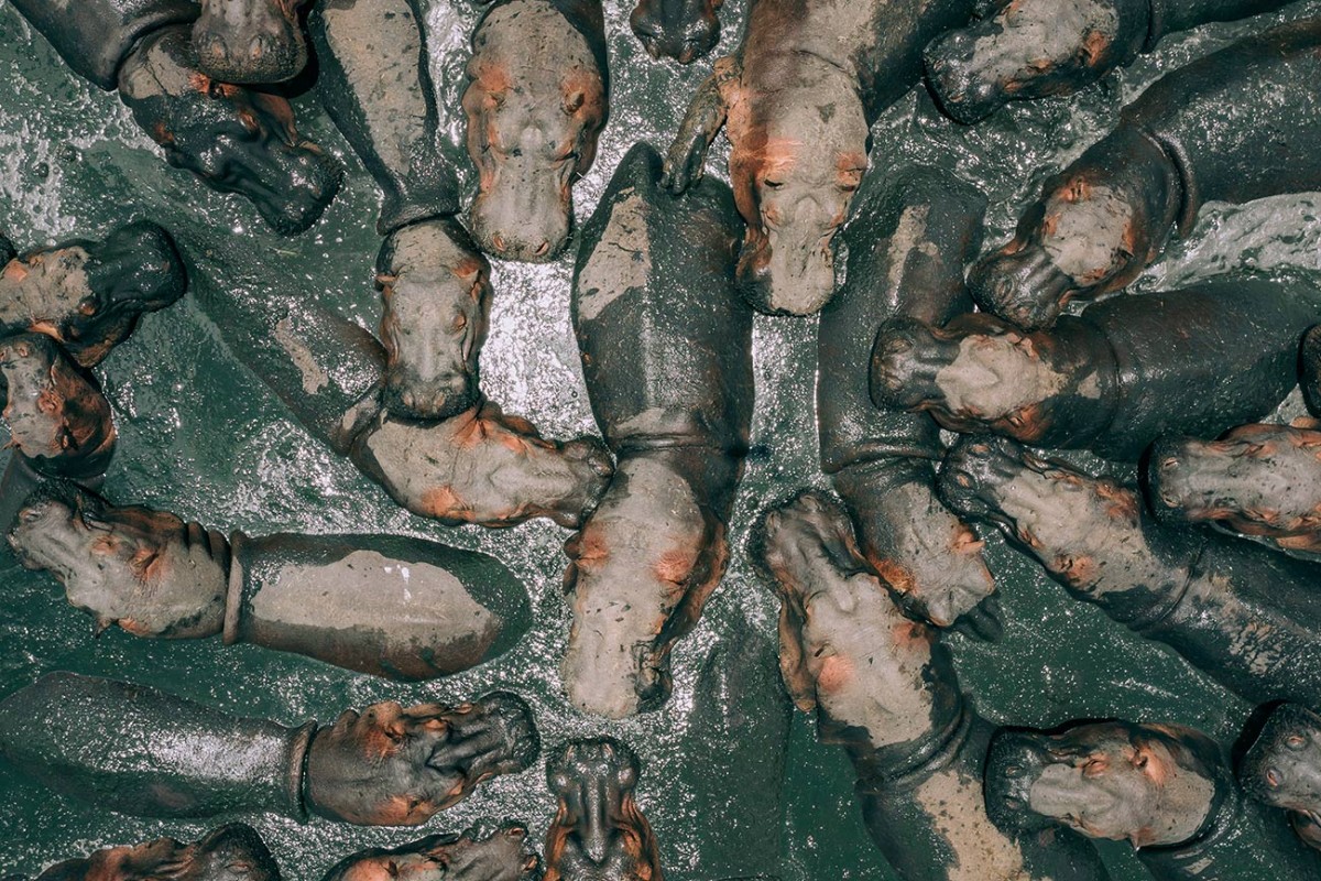
Visual Strategies Image
I chose this image because it had a compelling contrast in the white icebergs contrasted with the blue water and sky. This image also brings in different angles and sizes of the icebergs to add appeal. The artist also captured depth in this image with each iceberg displayed different distances away from the camera and the sky and other nature in the background.