
Read the chapter linked below, and then search online for an image that you find compelling. Add a comment to this posting. In your comment, paste the link to the image, and then add a few sentences discussing its visual strategies. Here is the reading:
http://teachmix.com/challenging/assets/visualbasicandstrategies.pdf
Comments


Visual Strategies
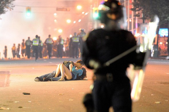
I chose this image mostly because of the use of foreground, middle ground, and background in order to correctly frame the photo and influence where the focus goes. Because the couple kissing in the middle is in focus, one's eye is naturally drawn there because it is a little off-center and, as stated before, in focus. The photographer uses contrast to show the stark difference between the policeman in the foreground clad in all black versus the light colors the couple wears. Lastly, the lighting of the picture is bright, demonstrating how there is a bright and happy moment in all the chaos.

Image
In this image, the focus of the photo is made very obvious. The man sitting on the ground is the only clear thing in the picture as the people walking around him are blurred. It conveys a sense of isolation/loneliness as everyone walks around this man ignoring him. The photographer also chose to make it black and white. By doing is it almost feels like all the joy/happiness has been drained from the photo. Even though the man isn't visually sad in the picture, by taking it in black/white it helps convey the sadness that the photographer is trying to show with the image.

image
http://www.kickvick.com/wp-content/uploads/2015/02/perfection-photos-a-04.jpg
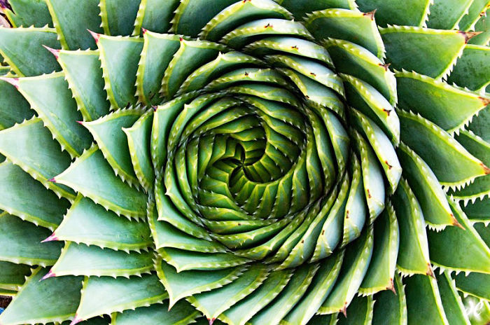
I chose this image because I really the texture in it. I also like how the spiral directs your attention to the middle, making the focal point of the image the center of the plant. The bright lightening and vibrant colors create a joyful mood. The colors are all cool, creating a cohesive feeling.

Image
I found this chapter particularly interesting because I have studied images in this way before, but in the context of website design. The colors, lines, directions, and everything else that makes up the photo is very important to the visual appeal of a website. This is a screengrab from the UNC School of Government. This photo is great for the website because the foreground has the school's sign in focus and leads the eye to the background to display the building itself. It also has a lot of cool colors which look nice together and tie into the Carolina blue of the rest of the website. Taking note of these lines and colors and other visuals can be applied to so many different types of displays to make them more effective.
Visual Strategies
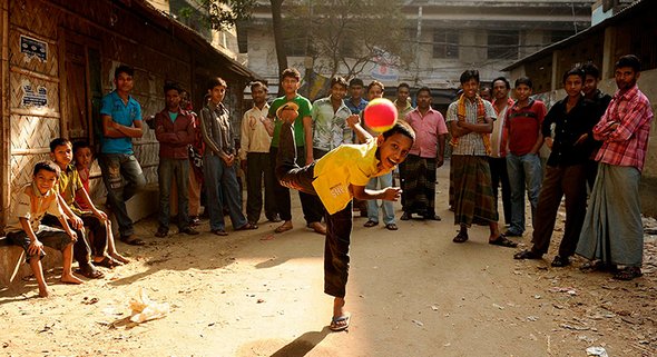
The most compelling visual elements of this photo include the placement of the ball being thrown, all of the persons in the photo looking directly at the camera, and the environment of a dirt road and crumbling buildings. The bright color of the boy's shirt in the middle immediately draws the eye first. The ball then catches the eye, with its placement near the focal point boy's head making it be one of the first things I noticed about the photo. The boy stands alone on one leg as the throws and this visual is juxtaposed by the row of all-male onlookers behind him. The bright colors in the center, of the boy's shirt and the ball help make this image compelling. I also think the off-center shadow lines and the sunlight casting down provide some nice contrast that brightens one space while darkening another. The light also coincides with the ages of the men in the photo, with the youngest being in the sunlight, and the older in the shadows.

I really like this picture…
 I really like this picture because it is very vivid and colorful. The different colors blend together nicely and the reflection of the orange mountains in the blue water stands out from the surrounding flowers, causing the viewer to look at the mountains as the subject of the painting. The light in the picture is coming from the sun and is reflected off of the mountains, causing them to glow. I think that the brightness and vividness creates a happy feeling and a respect for nature.

Compelling photo
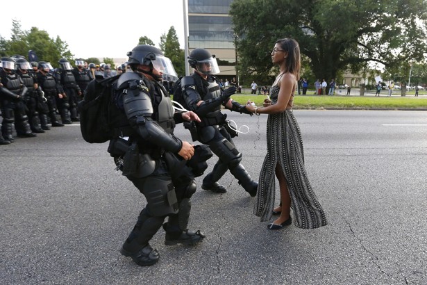
I feel like this photo is particularly effective, not only because of the visual elements, but the implied message behind it as well. The police's stance is jagged, indicating tension, motion, and fear while still being heavily armed while the girl is standing still and unafraid. The placement of the police officers in the background alongside the absence of protesters is also very effective. It creates depth to the police alongside the implication that they are unnecessarily afraid of people who are unarmed. The bleak color scheme effectively represents the unrest in society.

This was my favorite shot…
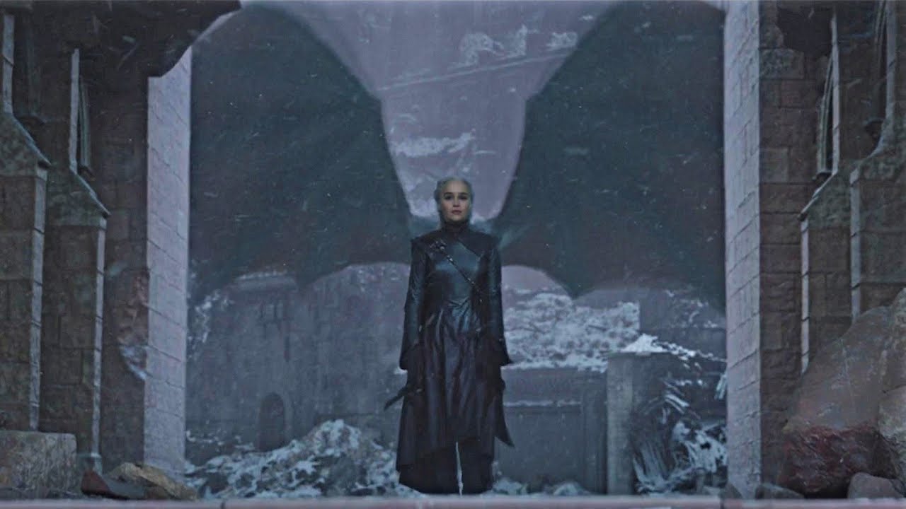
This was my favorite shot from the entire Game of Thrones series, and possibly TV History. The character in the frame had just come into power that she worked the entire series for, and also spent the majority of the series being called the "Last Dragon." Placing her in the middle of the frame allows for the eye to draw to her directly. The dragon wings behind her do many things for the frame. First, they place more emphasis on the actress and bring her to the front of the frame thus adding dimension. As most viewers would understand it, the dragon wings behind her make her into even more of "the last dragon" with this visual. Interestingly enough, this is the first time I have realized that the contrast in colors identified the character's arc ending. The black placed against the gray and pale background helps the viewer visualize how the character has evolved into a villain.

Interesting Visual Image
https://unsplash.com/s/photos/human (The first image on the page)
I found this image interesting since it highlights an important theme in life. This important theme refers to how people should move forward with life. Also, there are endless possibilities and opportunities for people in life that might be challenging to achieve. The picture focuses on the man in the picture by placing him in the center of the photo. The man is facing away from the photo and instead facing the mountains. In the background, there are mountains that seem simultaneously distant but also close enough to the man. This represents how the man is moving forward in life. The mountains represent how the man is able to attain his goals in life even though at times this can be challenging with all of the struggles and barriers that may occur.

Photo
https://media.mnn.com/assets/images/2017/08/PlasticTrashFloatingWater.jpg.653x0_q80_crop-smart.jpg
This image uses a nice homogenous color palette, drawing nicely from traditional ocean or maritime imagery. It becomes sinister on noticing the details, not the overall character, given that the water is filled with clear plastic garbage. It is also a wide, sweeping image, showing the extent and scale of the problem.

People Texting at Dinner Table
https://1349ibworldschooljournal.wordpress.com/2016/11/27/at-a-disconnected-dinner/
In this picture, everyone at the table is on their phones instead of enjoying each other's company or even the food itself. The colors are dull and everything is sort of out of focus. The dull colors reflect the atmosphere around the table as people refuse to engage with each other in person. There is only enough lighting to show the serious expressions on their faces. The slight blurriness of the photo shows how everything is just a passing moment and nothing is really memorable.

http://earthporm.com/wp…
http://earthporm.com/wp-content/uploads/2015/04/pp1-700x473.jpg
This is a very powerful image because of how it was visually taken and of its meaning. The thing that makes this photo visually successful is its impact. You see the hand of an adult male holding the hand of what appears to be a malnourished child in a third-world country. There's an implied message that individuals from first world countries are much better off than individuals in third world countries, and it's symbolized by how much smaller the child's hand is compared to the white adult.
https://www.google.com/url…
https://www.google.com/url?sa=i&rct=j&q=&esrc=s&source=images&cd=&ved=2ahUKEwiDud2Js4bmAhXMwVkKHUwoDfQQjRx6BAgBEAQ&url=https%3A%2F%2Fpeople.com%2Fpets%2Fphotos-show-real-life-lion-king-hug%2F&psig=AOvVaw1IlDvYiJHedpFoxYPmkEKu&ust=1574806911942415
I found this picture really cool because of how real-life it is. Like explained in the article, it is important to look at the emphasis of the photo. The emphasis is the two lions together because the background is almost non existant. The emphasis seems to be the relationship between the lion and his/her daughter/sonThe pictures focus on the two lions makes the photo so much more intense then it would have been without it. Outside of the lions it is very blurred which makes for a positive effect on the photo. The lions are beautiful, and almost look friendly. This photo has no words but the picture describes it all. To me, when i look at the picture it represents a lion and its children and how close they are. They would do anything for them because how comfortable the baby lion seems. In the artilce, I think that proximity is something that was very surprising to me in the article and something I never thought about when looking at photos. The chapter explains proximity as “the relative distances involved the placement of objects in a visual composition”(469). It seems like proximity wouldn’t even matter in a photo.
Visual Strategies
https://d3stdg5so273ei.cloudfront.net/emeraldannguyen/2019-05-30/370984/1400xAUTO/5a06af74888777-emeraldannguyen-crop.5c3d825b102c9.jpg
This digital painting plays with dimension very well. We can clearly see the difference between the background, middle ground, and foreground. The eye of a bird is like a dot that provides the focal point, it draws the eyes to the head of the bird. Because the lines used to create the rolling hills in the background are curved and not straight or jagged it gives a sense of natural motion. This picture has a mixture of warm and cool colors, so things brings mixed emotions into the image. The cool green colors of the woods seem ominous and spooky but the warm orange color in the center makes it seems like there's hope. Because this painting isn't zoomed in on just on an object there is hard to draw in conclusions on what really is the message of the painting.